Unveiling the Story of America’s Highway Typeface
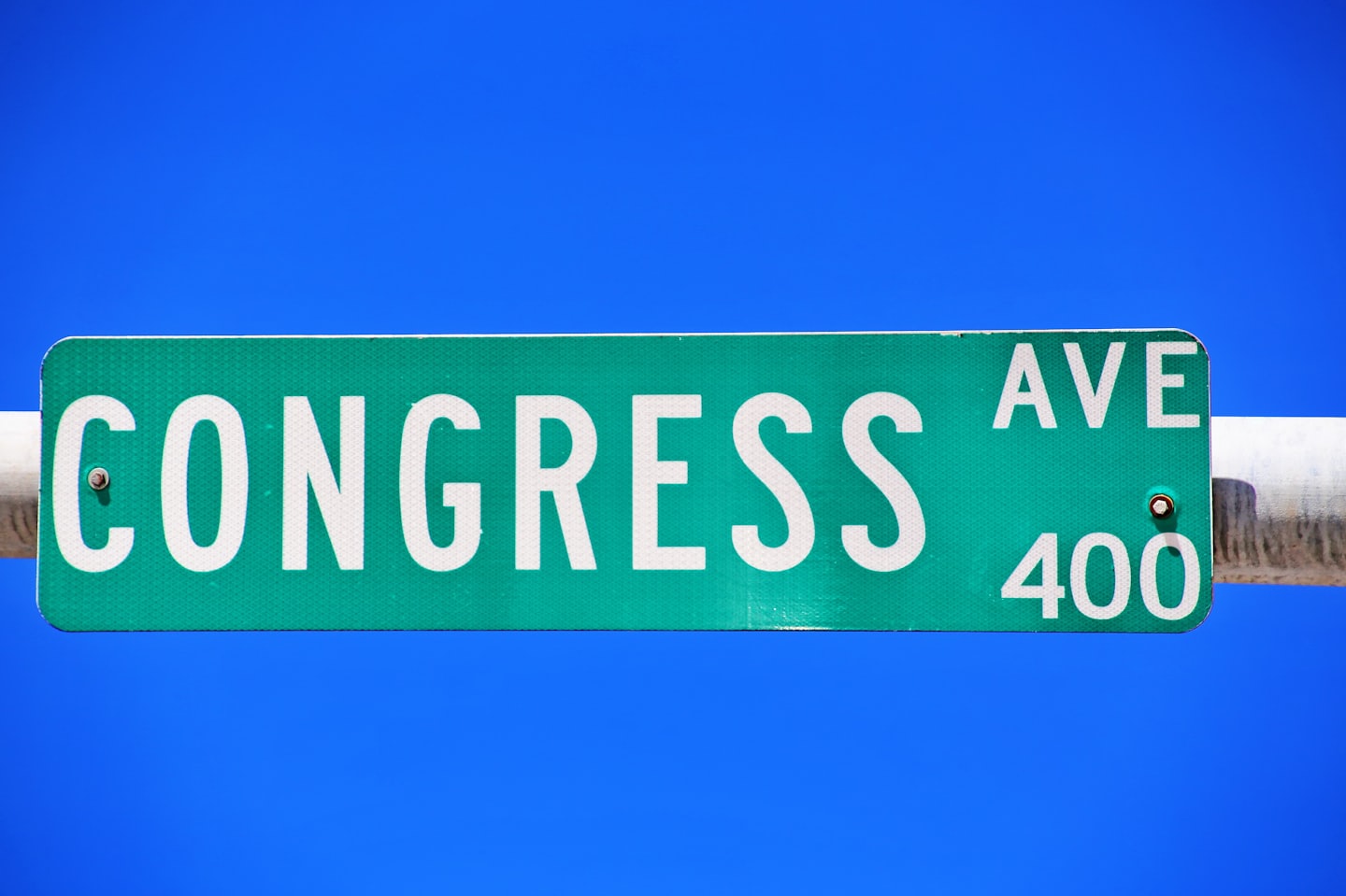
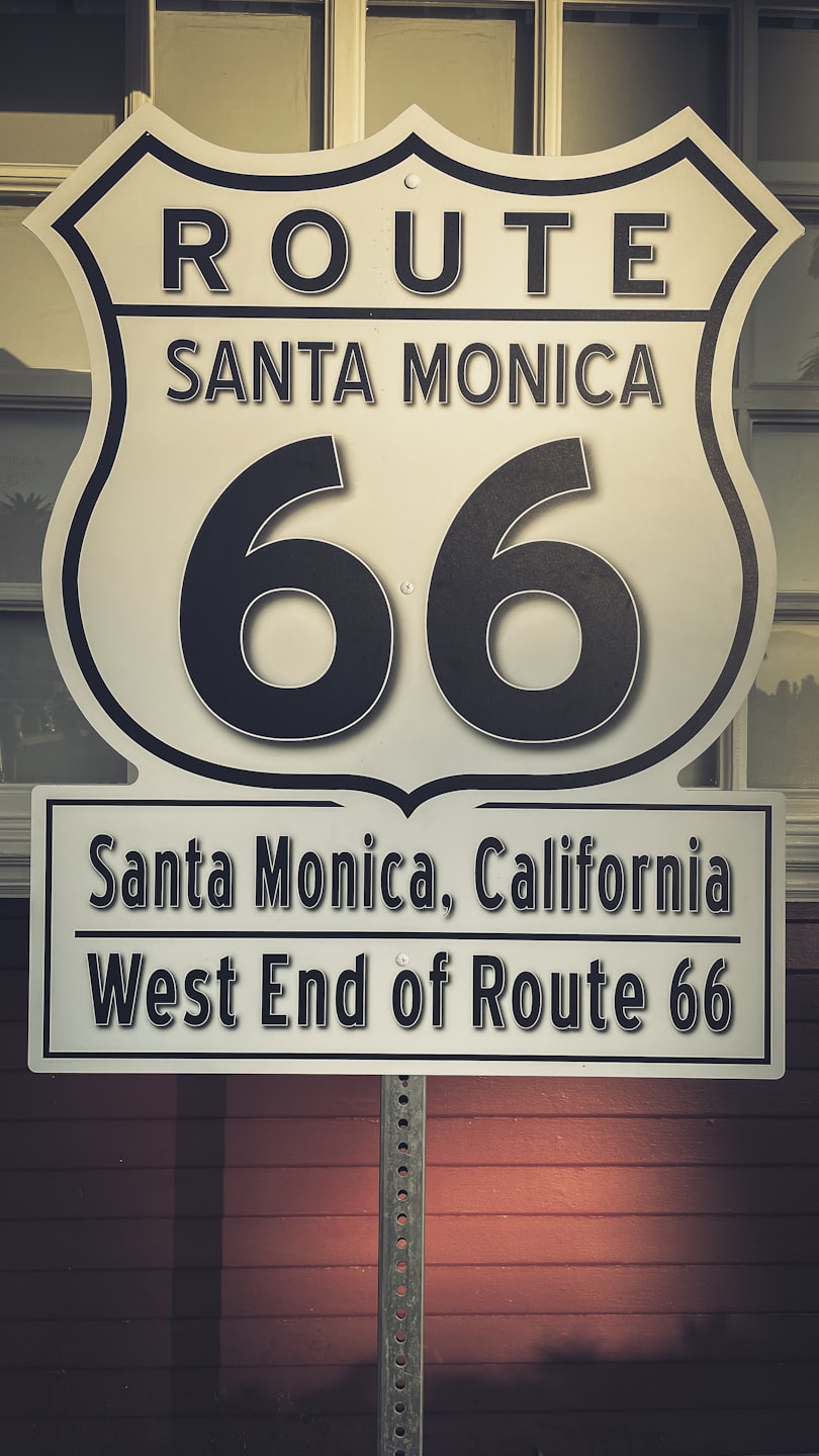
The Standard Alphabet embarks on a journey across the United States to trace the origins of the typeface seen on highway signs. Through a blend of photography, video, and meticulous historical research, the project explores how these letterforms embody both the poetry and authority of familiar road markers, revealing a unique visual language that shapes the American travel experience.

Tracing the Roots of America’s Highway Typeface
Explore a rich tapestry of photographs and stories revealing the history behind the iconic typeface on US road signs.

Tracing the Typeface of American Highways
Discover the journey behind the font that guides millions across the US, blending imagery, film, and history.
The Typeface Origins
Uncover the design roots and historical context of the highway signage font.
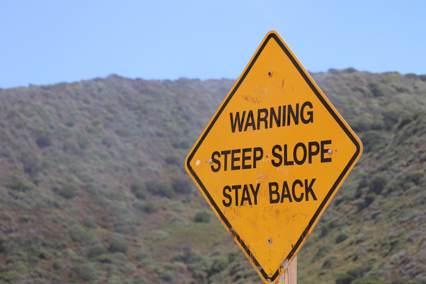
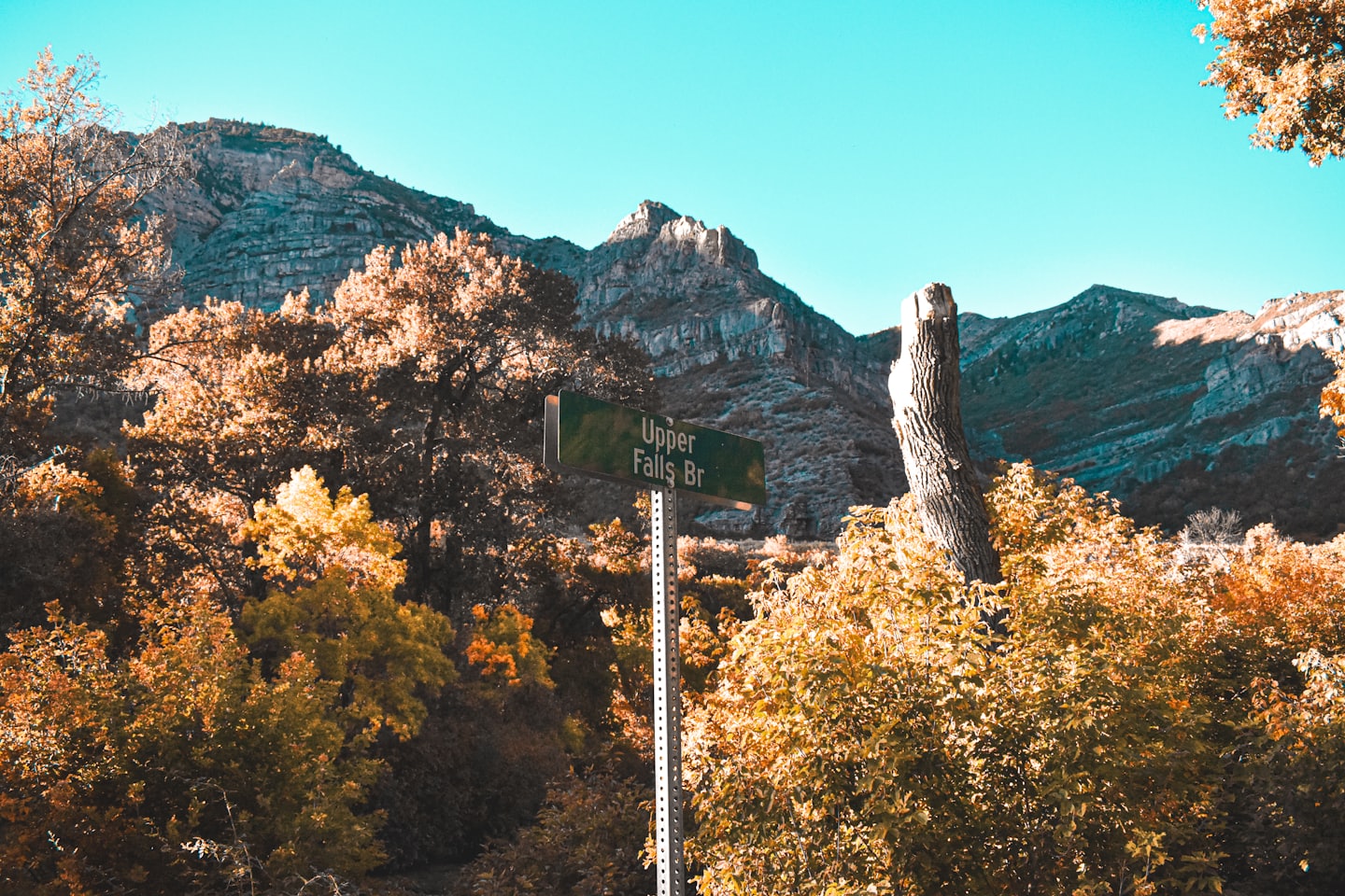
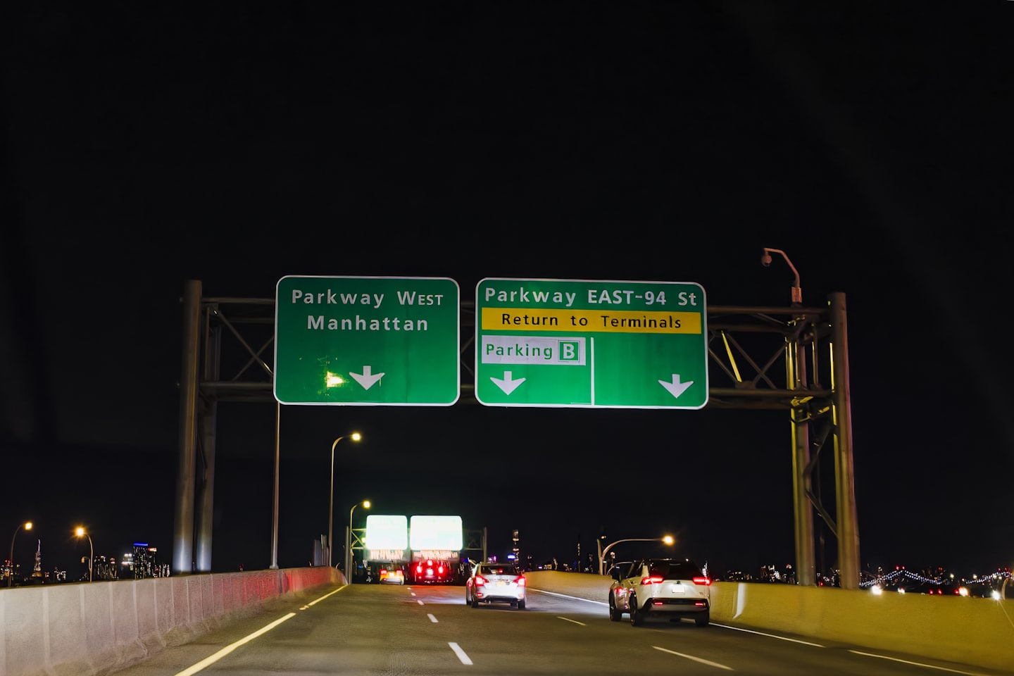
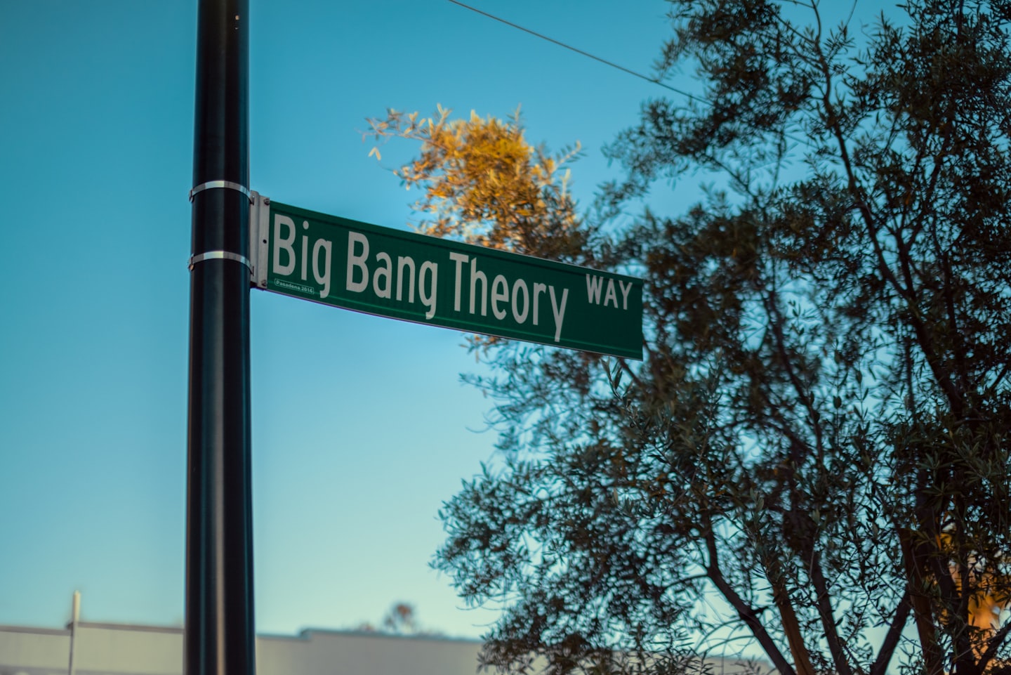
The Photographic Journey
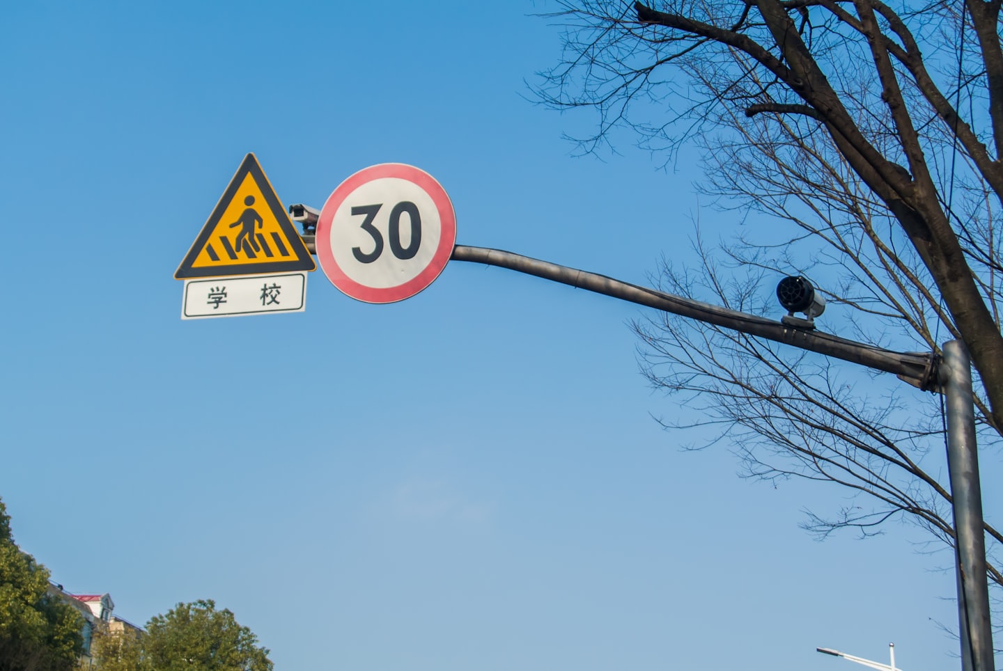
Experience the visual narrative capturing signs and landscapes across America.
Historical Research
Dive into archival discoveries and stories behind the typeface’s evolution.